Portfolio Site

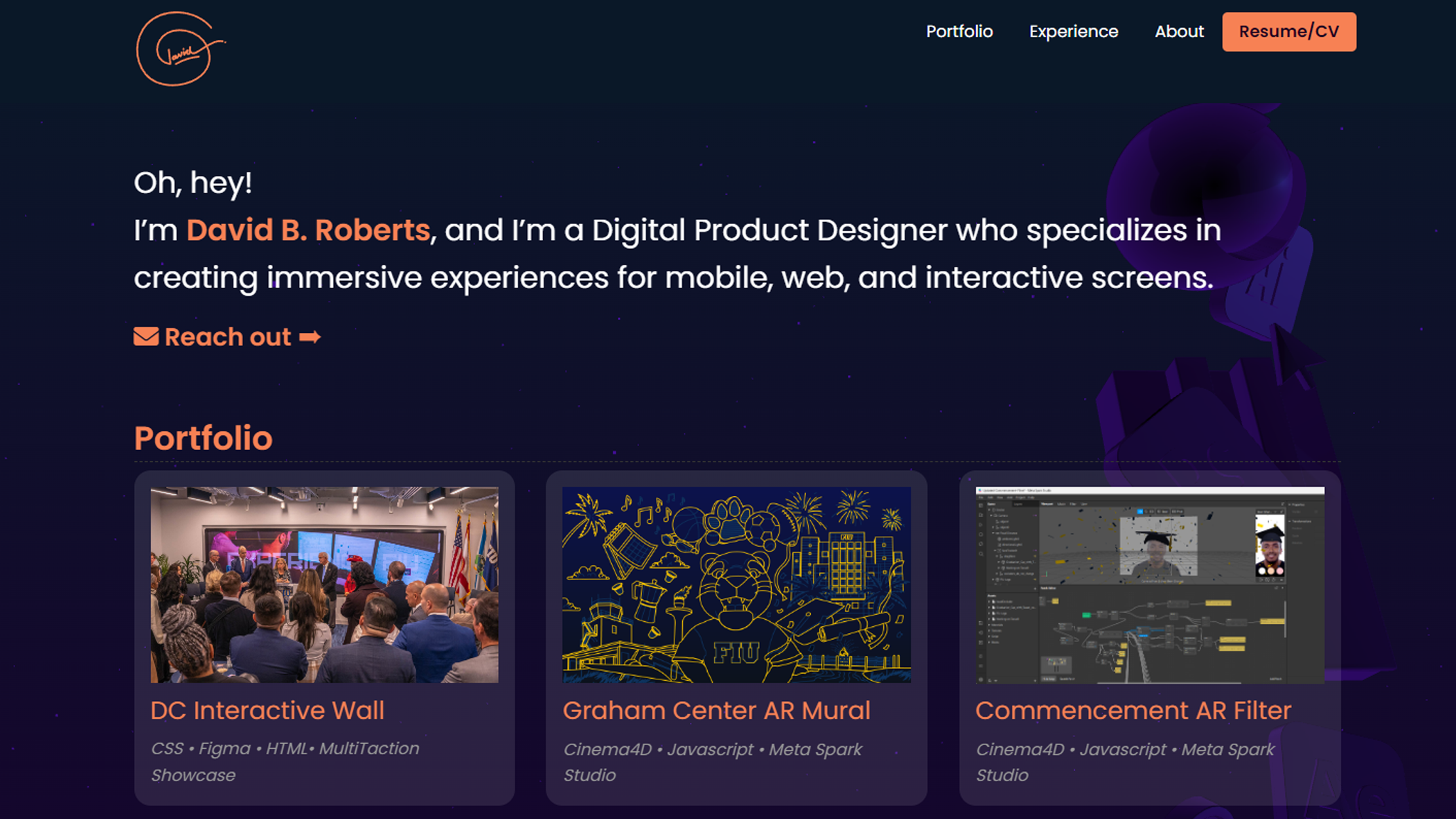
This recent iteration of my portfolio website posed an exciting challenge as I aimed to create a more focused and visually engaging site. Unlike the previous version, which was built with WordPress and Divi, this version utilizes the ZERB Foundation 6 responsive framework, which enabled me to create a clean and easy-to-use design.
To add some visual interest and make the site stand out, I incorporated Three.js elements in the background on the homepage, which gave it a unique and dynamic feel. Additionally, I implemented subtle CSS animations to add a touch of interactivity to the site.
During the design process, I chose a navy/purple color scheme to create a modern and sophisticated feel, which was contrasted with a coral color for links and headers to add a playful touch. These color choices effectively showcase my design skills and attention to detail. Overall, I am proud of how the website turned out, and I believe it effectively showcases my work and design abilities.
Client:Personal
Role:Front-End DevelopmentBack-End DevelopmentDesignContent StrategyProject Management
Tools:ZERB Foundation 6 Adobe IllustratorAdobe PhotoshopThree.js
Development:HTMLCSSJavascript